The Client
Community Lodgings is a nonprofit organization whose mission is to lift low-income families from homelessness to self-sufficiency by providing a variety of community outreach programs. These students are already at high risk of the “summer slide,” losing months of literacy over the summer due to the lack of access to learning resources. Then, COVID-19 hit. Community Lodgings and the families they serve were greatly impacted. Schools closed, summer camp was canceled, and a new threat to students emerged—the “corona slide.”
With the pandemic closing doors and forcing people to physically distance, Community Lodgings had to rethink their in-person fundraising events. They took a chance and applied for Do Good+Work—our annual pro bono campaign providing professional graphic design services to a nonprofit organization. Their application immediately caught our eye, and we were thrilled to announce them as the winning entry.
Services
Digital
Branding
The Challenge
Community Lodgings decided on a virtual “Read-A-Thon” campaign encouraging students to maintain their reading skills, as well as acting as a fundraiser to support operating costs and programming for the next school year. In addition to engaging students, this new program would need to reach donors comprised of long-time supporters from Alexandria, city officials, and the local school system students of the families they serve with a focus on grades second through sixth. Donations would be used for book drop-offs, e-books, and virtual reading sessions hosted by teachers. While the main ask was for a logo, we saw so much potential for creativity!
The Process and Results
We realized the read-a-thon needed a catchy name to build the brand around. First, we wanted to create the idea that even though regular summer camps are canceled, and kids are stuck at home, they can still get AWAY this summer. In fact, they can go anywhere a book takes them if they use their imagination. Second, we wanted to remind donors that reading is an attainable way to maintain literacy and reading levels. Reading gives disadvantaged children A WAY to level the playing field. It didn’t take long to land on a name with a perfect double entendre—Camp Read-A-Way!
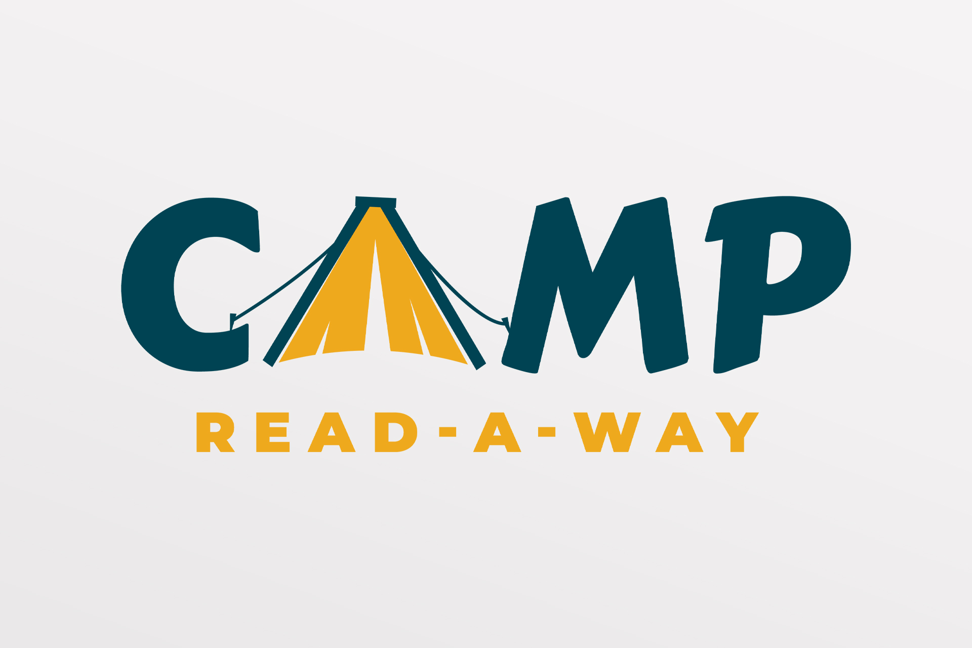
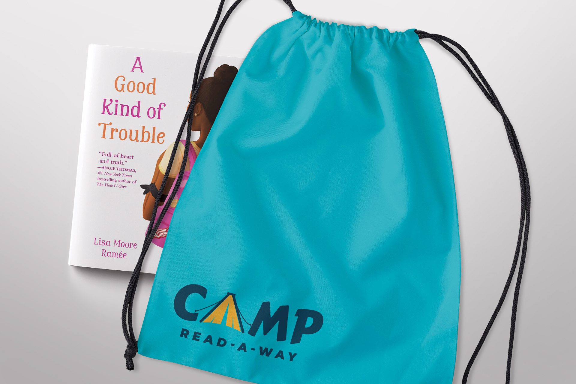
A clever program name demands engaging and supportive branding. In designing the Camp Read-A-Way logo, we needed to visually depict both parts of the message—the “away” and “a-way”. To achieve this, we created a graphic “A” that is a camping tent and a book combined. We also established a palette of kid-friendly yellow and blue, however the logo colors can change depending on imagery the logo is used with, showing the versatility of its design and to offer some added fun.
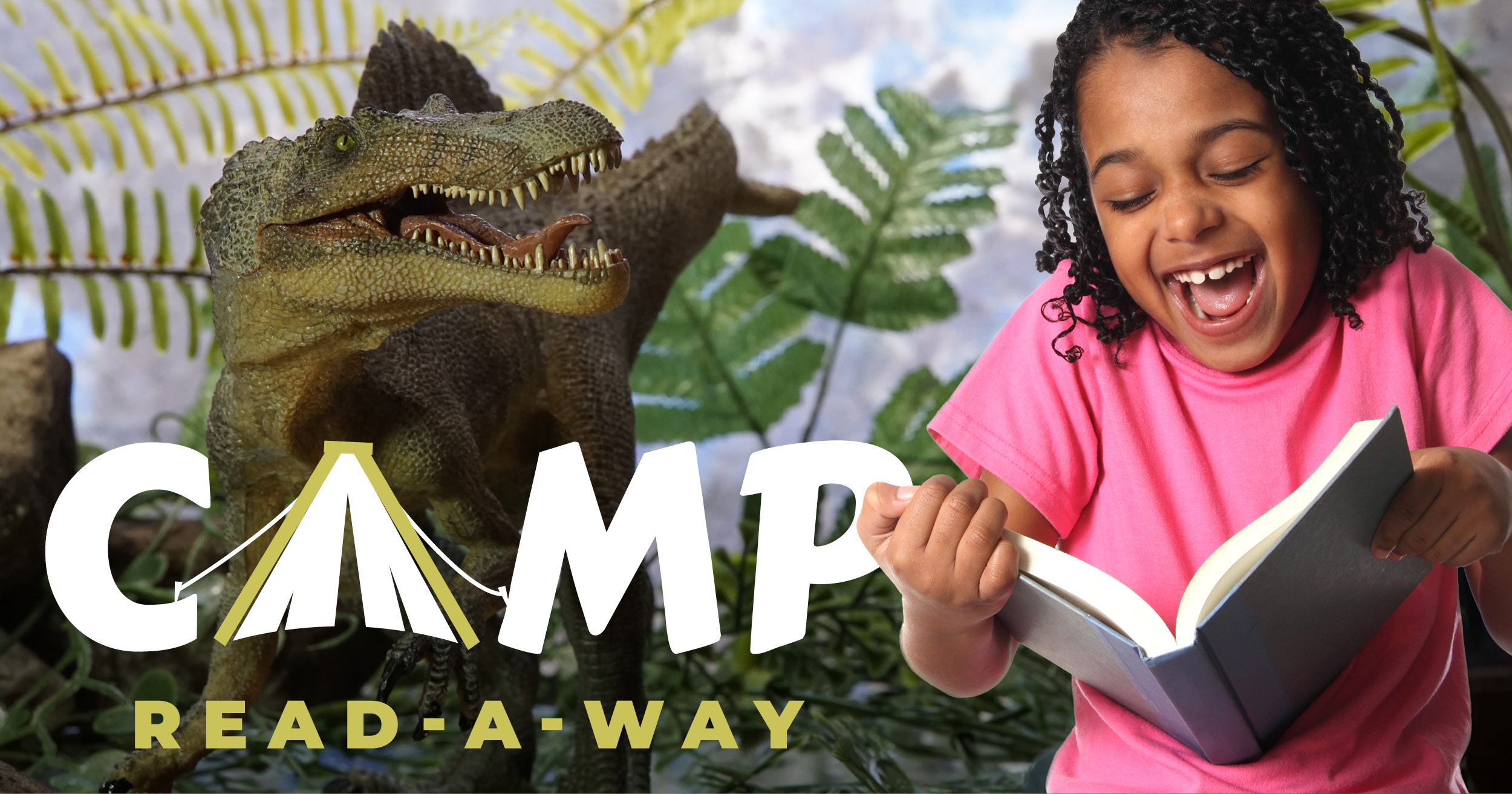
Next up, we designed social media graphics. With COVID-19 interrupting many of the usual aspects of everyday life, we knew that now more than ever, digital marketing is key! We created three cohesive graphics to be used as needed on Instagram, Facebook and Twitter. The designs feature a photograph of a grade school student reading a book or e-book. The backgrounds bring imagination to life—enter a kingdom of fairytale castles, dive down deep in a submarine, or get lost in the jungle with dinosaurs!
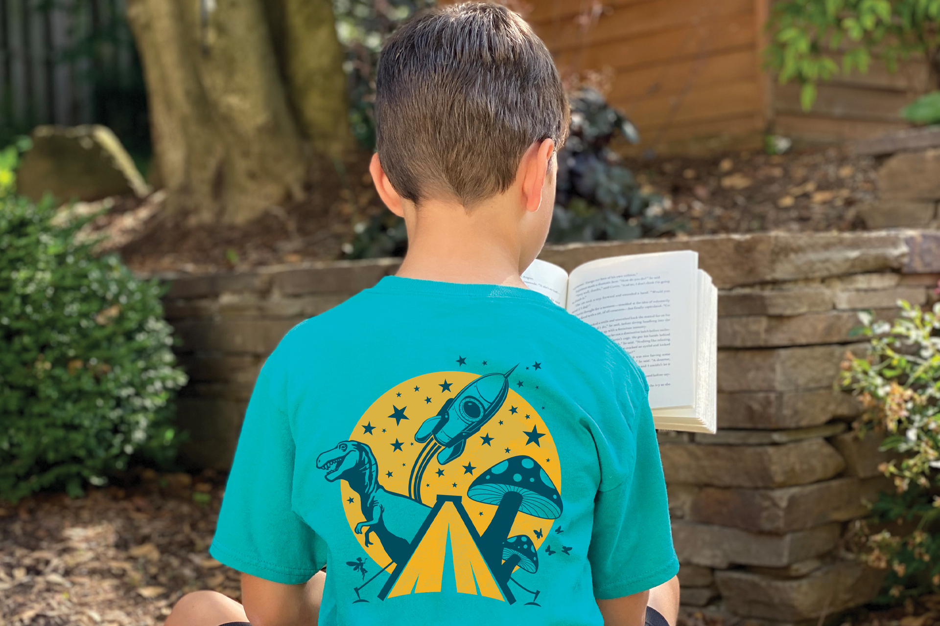
To finish off the series, we wanted to leave Community Lodgings with a tangible Camp Read-A-Way piece. Using the logo and imagery inspired by the social media graphics, we created a branded t-shirt for students who participate in the program.

